Notes from an Artist’s ToolboxThis blog is a place to share what I’m exploring, experimenting with, and learning as a photographer and visual artist.
I’m interested in what happens when photography moves beyond simply recording what we see. Sometimes that means working with light and movement in the camera; sometimes it means infrared, alternative processes, digital tools, or emerging technologies. Often it means combining several of them.
These posts grow out of my own creative practice and the workshops I teach. They aren’t intended as formulas for making a particular kind of image. Instead, I hope they offer ideas, techniques, and starting points for developing your own way of seeing and making. Above all, I believe photography can be both a way of witnessing the world and a starting point for interpreting it. Working with iColorama
August 19, 2026
•
Leave a Comment
iColorama from the BeginningA beginner’s guide to turning photographs into creative artwork
iColorama is one of those apps that can be both exciting and overwhelming the first time you open it. It is a full-featured art app with an enormous range of tools for changing tone and color, adding texture, creating painterly effects, distorting images, blending photographs, drawing, adding text and building artwork from scratch. There two versions are iColorama (built specifically for iPad) and IColorama S (built specifically for iPhone). The interfaces are different. Make sure you you download the correct version for your device. "Which app do I download?"
Be aware this is not a simple app. With dozens of menu choices and hundreds of effects, the temptation is to start tapping everything. A better approach is to learn a small group of tools first, understand the basic workflow, and then explore. This guide follows that approach. Rather than trying to explain every feature in iColorama, I’ll concentrate on processing photographs and on the tools that can get you creating quickly.
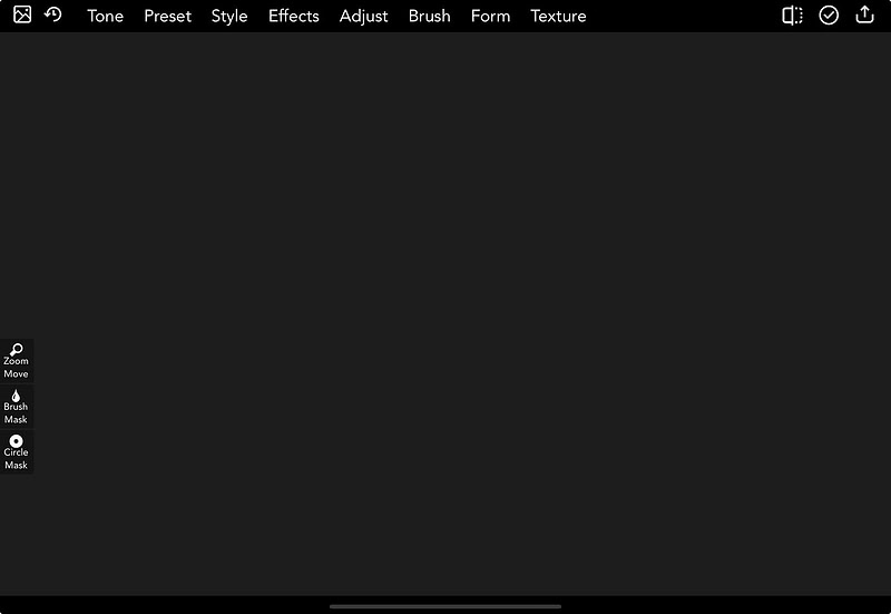
First: Don’t Let the Interface Intimidate YouiColorama is designed for creative exploration rather than technical precision. The iPhone and iPad interfaces look different because screen space is limited on the phone, but the basic functionality is the same. When you first open the app, concentrate on the main menu. You do not need to understand every button before you begin.
The Main Menu
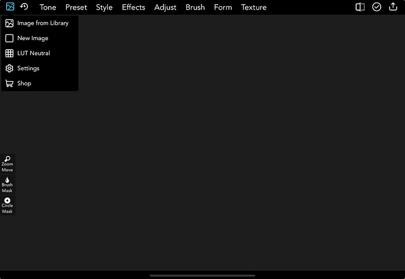
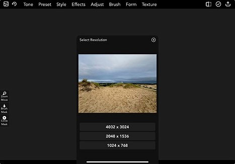
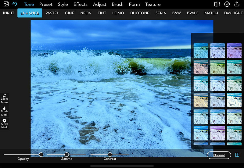
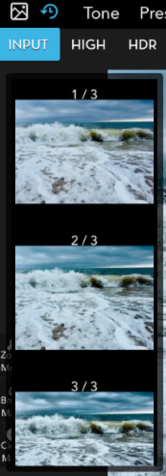
Most iColorama editing follows the same pattern: choose a main category, select an effect or preset, adjust the available controls, preview the result, and then either apply it or try something different. Opening an ImageStart by choosing Image from Library and selecting a photograph.
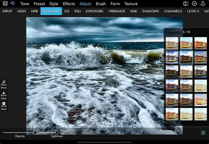
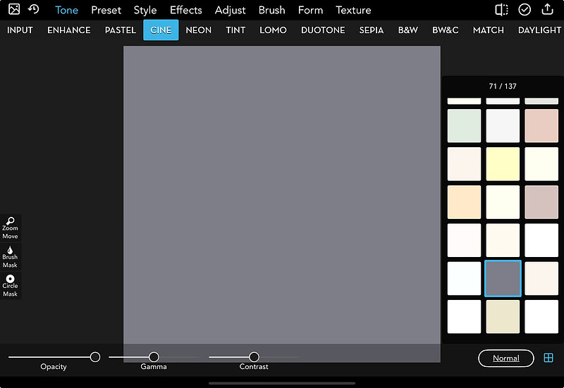
For your first experiments, choose a photograph with good lighting, a clear subject, and enough color or tonal variation to make the effects easy to see. Understanding Presets and AdjustmentsMany iColorama tools contain scrollable submenus filled with presets. Tap a preset to preview it. Depending on the tool, you may then be able to change opacity, gamma, contrast, lightness, sharpness or other settings. Opacity is one of the most useful controls in the entire app. An effect that looks too strong at 100 percent can become much more interesting when reduced to 50 or 60 percent.
Apply vs. Save: An Important DistinctionAll edits in IColorama are non-destructive. Think of iColorama as putting a clear plastic sheet over your original photo. When you pick a filter, change colors, or add a texture, you are drawing on that clear plastic sheet. Your original photo underneath is completely safe and unchanged until the filter is applied. Any change you see on your screen is just a temporary preview. If you don't like it, you can hit "Input" or choose a different slider, and the change vanishes instantly.
The change only becomes permanent when you tap the Apply button , a check mark at the top right of the screen. Once you hit Apply, you can layer a brand-new effect on top of it.
After choosing a preset, controls such as opacity, gamma and contrast let you refine the look. Save exports the current preview to your Photos library.
This makes it easy to keep several versions without committing to an effect. Try an effect, save it, try something different on the same starting image, and compare the versions later.
You do not have to use every step on every photograph. Think of this as a starting recipe rather than a rule.
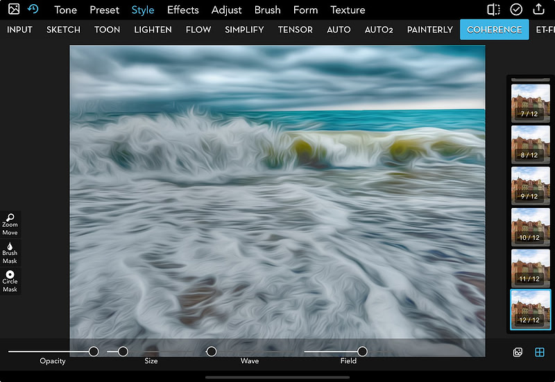
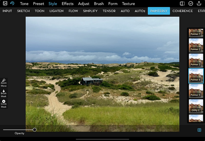
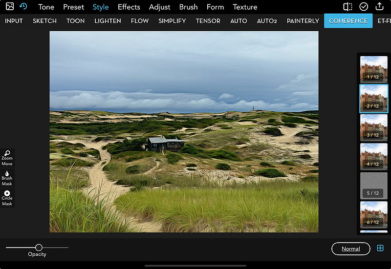
Creating a Painterly ImagePainterly treatments are one of iColorama’s strengths. Start with a photograph that has a clear subject and interesting color relationships. Make any basic tonal adjustments first, then move into Style. Try Painterly, Coherence, Water or Mosaic. Use opacity to determine how much of the original photograph remains visible. For a more natural result, begin around 50–70 percent. For a more abstract image, push the effect higher. You can apply one style and then add another, returning to Tone or Adjust afterward if the image needs correction. Less is often more. A strong filter may be impressive for a few seconds, but reducing its strength can preserve the character of the original photograph while still giving it a handmade quality.
Try the Same Photograph More Than One WayOne of the best ways to learn iColorama is to process the same photograph with different styles. The two landscape examples below use different Style treatments. Neither is “right.” The point is to notice how each treatment changes texture, detail and mood.
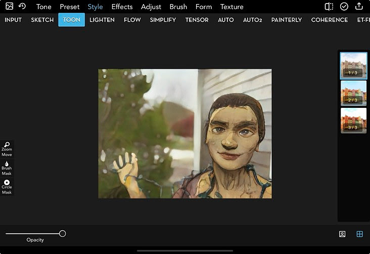
Turning Photographs into CartoonsCartoon treatments work particularly well with portraits, pets and objects that have clear outlines. Simple backgrounds and good contrast help.
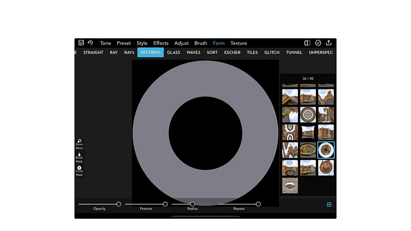
Going Further: Forms and DistortionOnce you are comfortable with basic processing, iColorama becomes much more interesting. The Form menu allows you to distort and transform photographs in ways that move beyond conventional photo editing. Portraits, architecture, geometric objects, strong lines, centered subjects, horizons, flowers and even text can all become raw material for distortion. Very busy or low-contrast photographs tend to be harder to control. Making Something from NothingYou do not even need to begin with a photograph. iColorama can create abstract artwork from a blank image.
This is where iColorama becomes less like a photo editor and more like a digital art studio. A gradient or field of color can become a texture, an abstract background or a finished image.
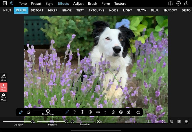
Blending ImagesBlending is another powerful way to move beyond a single photograph. Blend loads a second image over your current image and lets you combine the two using blend modes such as Normal, Multiply, Overlay and Screen. It is useful for composites, adding textures, replacing skies and creating collage-like images. Think of Blend as placing one transparent sheet over another and deciding how the two interact. Blend = layer them. Mixer = mix them. Mixer can combine several images more automatically, with less precise control over placement.
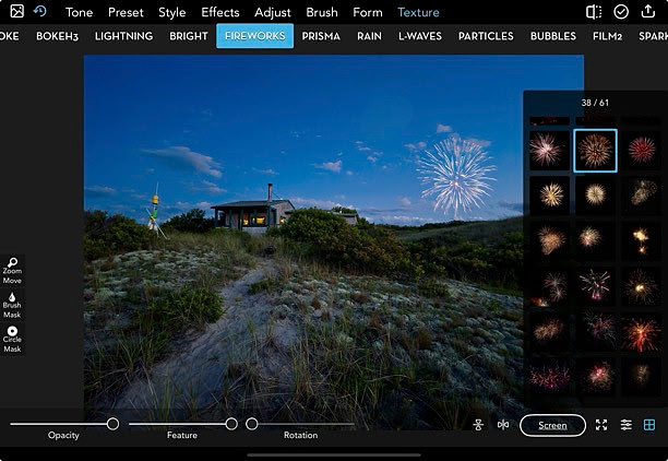
Blending a photograph with a painterly effect. Textures, Effects and BrushesOnce you understand the core workflow, explore the parts of iColorama that are simply fun. Textures can add paper, bokeh, fireworks, smoke and other visual elements. Effects can erase or modify parts of an image. Brushes allow you to paint and draw directly into your artwork. These tools become especially useful when combined. You might create an abstract form, use it as a texture over a photograph, erase part of the texture, and then finish with a brush.
A Few Tips Before You Dive InStart with one effect and learn what it does before stacking several more. Use opacity. Save multiple versions and compare them later. Try the same effect on different types of photographs. And do not be afraid to make something strange—distortion and experimentation are part of what makes iColorama interesting. The Most Important Thing: ExploreThe sheer number of choices in iColorama can make the app seem complicated, but you do not need to learn all of them. Begin with Tone, Adjust, Style and a few favorite presets. Then add Forms, Blend, Textures and Brushes as you become more comfortable. There is no single correct iColorama workflow. Try something, adjust it, save a version, combine it with something else, and see where the image takes you. That sense of discovery is the real strength of iColorama. Quick Reference: A Beginner’s iColorama Recipe
Start simple. Save often. Combine effects. Experiment fearlessly.
Newer Posts »
© Rachael Sokolowski
|